designing for Helma.org
2005-9-21
As I noted earlier, I'm dedicated to contributing to the uplifting of Helma to the new orbit of version 2. I won't be doing it full-time so I'm trying to fit in as much as I can. Here's one such contribution to the design of Helma.org - the website, not the software:
So here are some concepts I came up with over the last week. The goal was to try and freshen and modernize the current look. It's sites like mozilla.org and rubyonrails.com the new helma.org look should compete with.
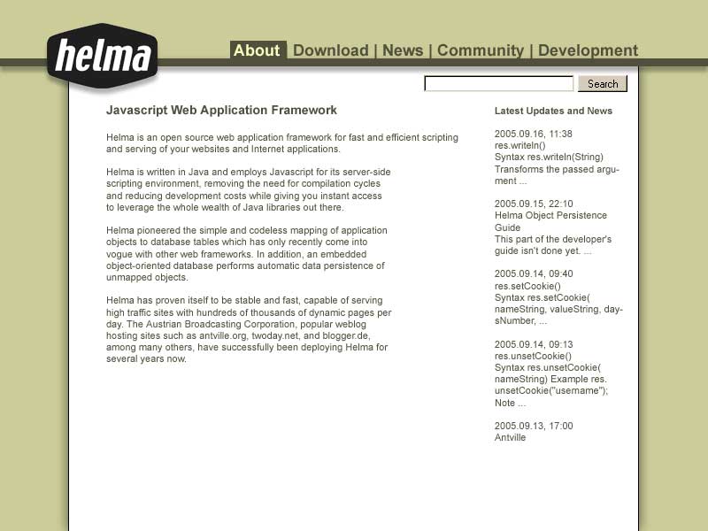 This is my first try. I kept most everything from the old design, simply re-arranging things and doing some drop shadow atuff. The colors - still - look tired, and things feel 'boxed in'.
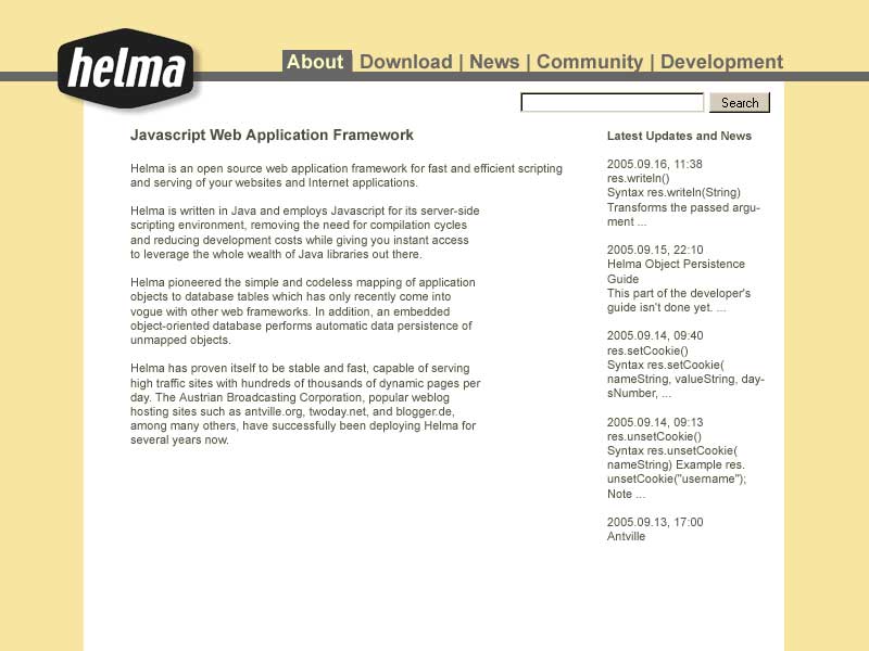 This next one is the same basic layout as the first, only trying to rid the boxed-in feeling and the beige background. Better?
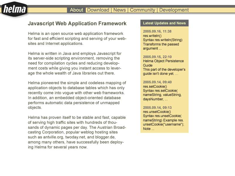 And here's my current approach. Re-doing the header and trying some new lines. Still not sure if this will catapult helma.org into 2006 and beyond...
Similar
<< tracking external links with(out) AJAX | I'm not alone >>
alles Bild, Text und Tonmaterial ist © Martin Spernau, Verwendung und Reproduktion erfordert die Zustimmung des Authors
Martin Spernau
© 1994-2026
![]()
amazon.de Wunschliste
Facebook me!
Google+


Older Archives on Tindertraum
powered by Traumtank